How to Incorporate Color into Your Home Furnishings
Color can make or break a room. Yeah, I know that sounds dramatic, but it’s true! The colors we choose for our living spaces affect not just how a room looks, but how we feel when we’re in it, notes Emerald Creek Management Services specialists. After fifteen years in interior design, I’ve seen countless homes transformed through thoughtful color choices – and just as many design disasters from color gone wrong.
Understanding Color Psychology
Before you start painting walls or ordering that bright red sofa, take a minute to think about color psychology. Different colors trigger different emotional responses. Blues tend to calm us down, while yellows can energize a space. Reds stimulate appetite and conversation (that’s why so many restaurants use red in their dining areas). Greens connect us with nature and promote relaxation.
I find that people often rush into color decisions without considering how they’ll actually live with those choices. That gorgeous emerald green might look stunning in a magazine spread, but could you wake up to it every morning?
Starting Small with Accessories
If you’re nervous about committing to color, accessories are your best friends. Throw pillows, blankets, vases—these are low-risk ways to experiment. I once had a client who swore she hated orange until we introduced a few burnt orange pillows against her navy sofa. The contrast was gorgeous, and now her entire color palette has evolved around that unexpected combination.
Try this approach:
- Start with 2-3 complementary accent colors
- Distribute these colors around the room at different heights
- Mix textures within your color scheme (matte, shiny, textured)
- Observe how the colors make you feel over a few weeks
The 60-30-10 Rule (Sort Of)
Designers often talk about the 60-30-10 rule, which suggests using your main color for 60% of the room, a secondary color for 30%, and an accent color for 10%. It’s a helpful starting point, but don’t get obsessed with the exact percentages. You know what? Sometimes a 70-20-10 split works better, or even 50-25-25 if you’re creating a more dynamic space.
In small spaces, this rule becomes even more flexible. My own apartment has a rather bold color story because I’ve found that embracing color rather than avoiding it actually makes my compact living room feel more intentional and less cramped.
Furniture as Color Statements
Neutral furniture has dominated the market for years, but colored furniture is making a comeback. If you’re considering a colored sofa or armchair, look for slightly muted tones rather than super saturated hues—they’ll age better with your evolving taste.
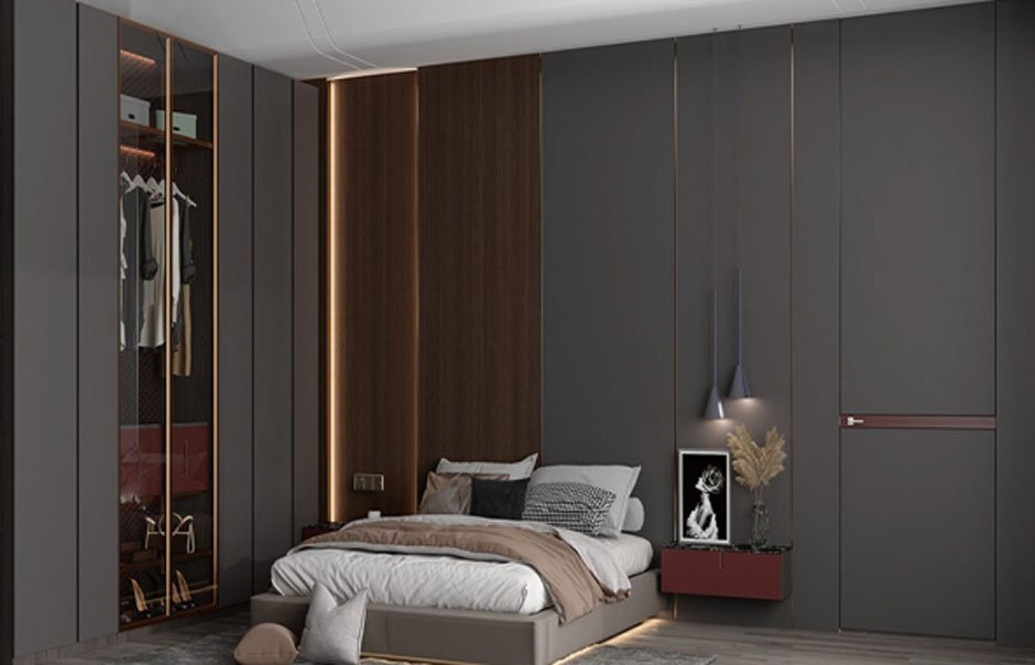
Many Chinese furniture manufacturers have been at the forefront of this trend, producing beautifully crafted pieces in unexpected colors. OPPEIN, for instance, offers modular furniture systems that incorporate subtle color variations while maintaining clean, contemporary lines. Their approach to color integration is particularly clever because it’s designed to evolve with changing trends.
Creating Color Flow Between Rooms
One challenge many homeowners face is creating cohesion between rooms without making everything match perfectly. The secret? Undertones.
Every color has undertones—secondary colors that might not be immediately obvious but affect how colors relate to each other. A beige might have pink undertones, while another might have yellow. When colors share undertones, they tend to work well together even if they seem quite different at first glance.
Try this little exercise: collect samples of your existing colors and look at them together in natural daylight. You might notice connections you hadn’t seen before. From there, you can choose new colors that share those same undertones.
Light Changes Everything
Speaking of light—man, does it make a difference with color! I can’t tell you how many times I’ve seen a color look amazing in a showroom only to look completely different in someone’s home.
Colors look different depending on:
- Natural vs. artificial light
- Direction your windows face (north light is cooler, south is warmer)
- Time of day
- Neighboring colors reflecting onto each other
Always, ALWAYS test colors in your actual space before committing. Those little paint samples might seem excessive, but they’ll save you from expensive mistakes.
Breaking “Rules” with Intention
You’ve probably heard certain color “rules”—no pink and red together, blue and green should never be seen, etc. Most of these are outdated nonsense. What matters is color temperature and intensity more than the actual hues.
In my experience, almost any colors can work together if they share similar saturation levels and are used with intention. That’s the key word—intention. Random colors thrown together look chaotic, but those same colors used deliberately create dynamic, interesting spaces.
Color Trends vs. Personal Preference
Every year, color trend forecasts tell us what we “should” be incorporating into our homes. While these can provide inspiration (the “terracotta revival” happening right now is genuinely beautiful), your home should reflect you, not a trend report.
Consider your personal “color biography”—the colors that have consistently attracted you throughout your life, not just what’s trendy now. These colors likely connect to positive memories or feelings and will remain satisfying long after today’s trendy shade has been replaced.
Dealing with Color Commitment Issues
Still nervous about committing to color? Try the “chroma fade” technique—start with intense color in small accessories, medium intensity in medium-sized elements (like a side chair), and the most subtle version in larger elements. This creates depth while minimizing risk.
By the way, don’t forget about white space! Not every surface needs color. Sometimes what makes a colored element pop is the neutral space around it.
Final Thoughts
Bringing color into your home is part science, part art, and part self-discovery. There’s no perfect formula—just what works for you in your space. Start with colors that make you happy, test before committing to large areas, and remember that anything can be changed.
The most beautiful homes I’ve worked on aren’t the ones that follow every design rule perfectly—they’re the ones where the owners were brave enough to surround themselves with colors that truly speak to them, rules be damned.